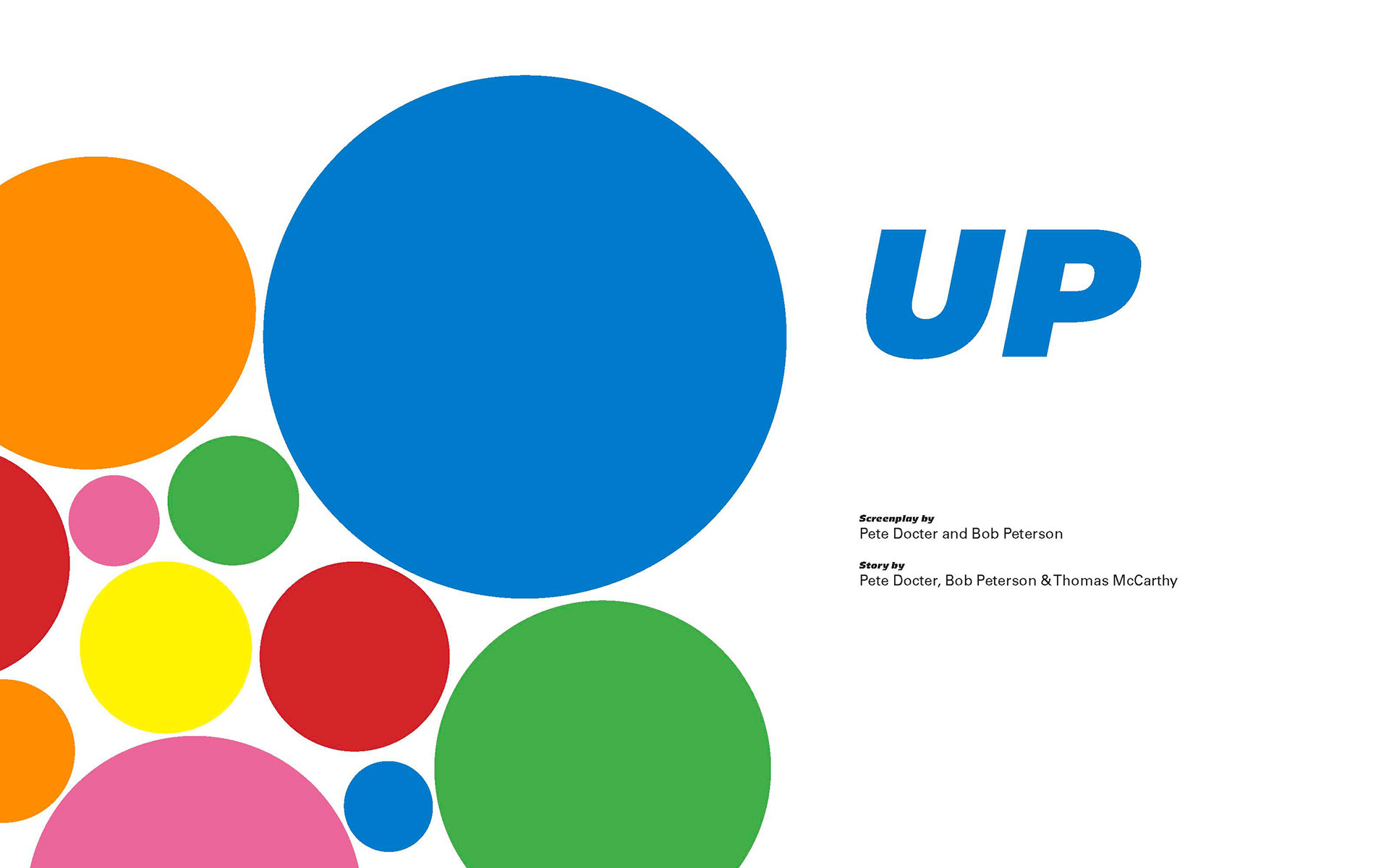
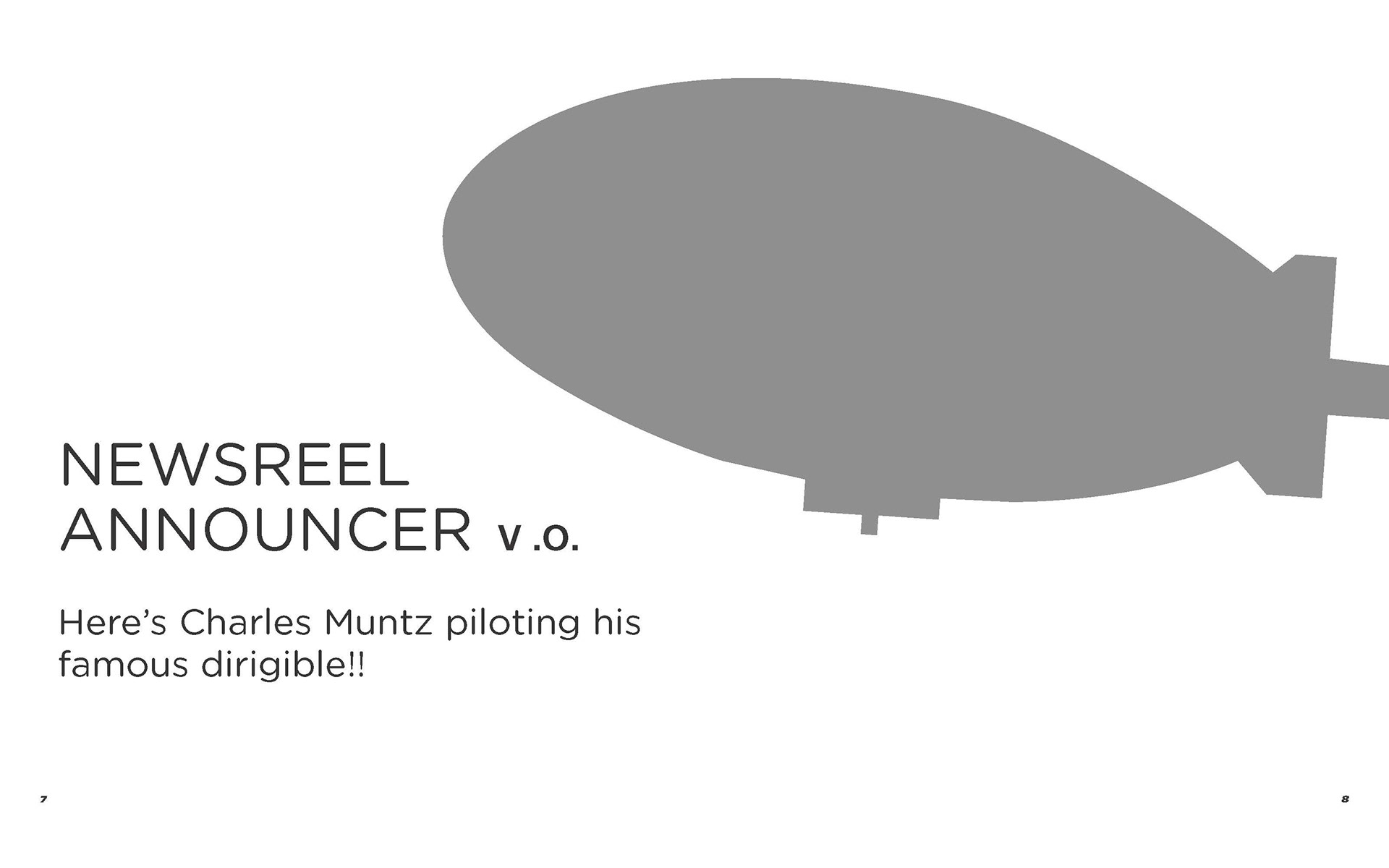
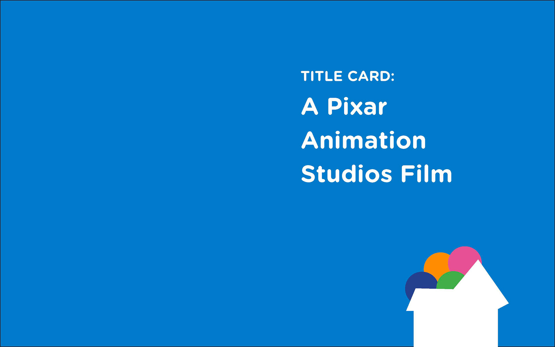
Progression of title cards at the beginning of the movie:
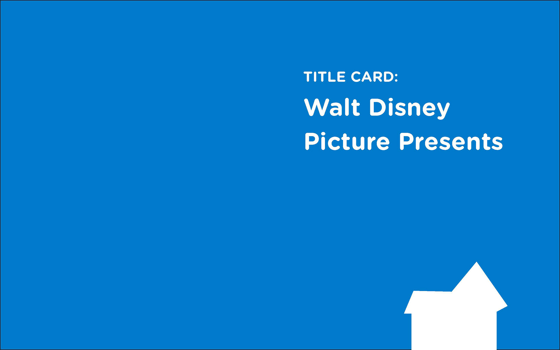
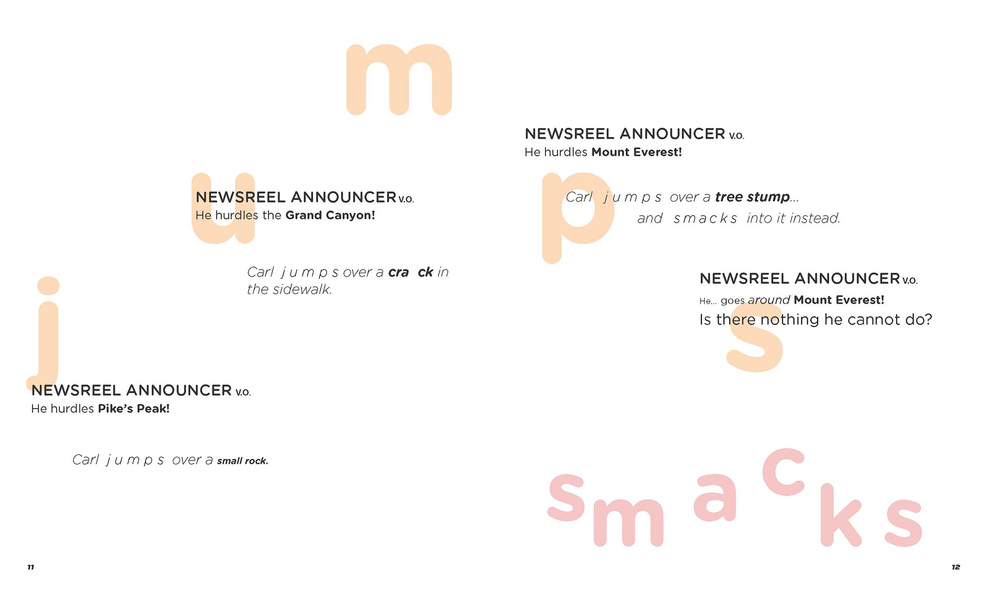

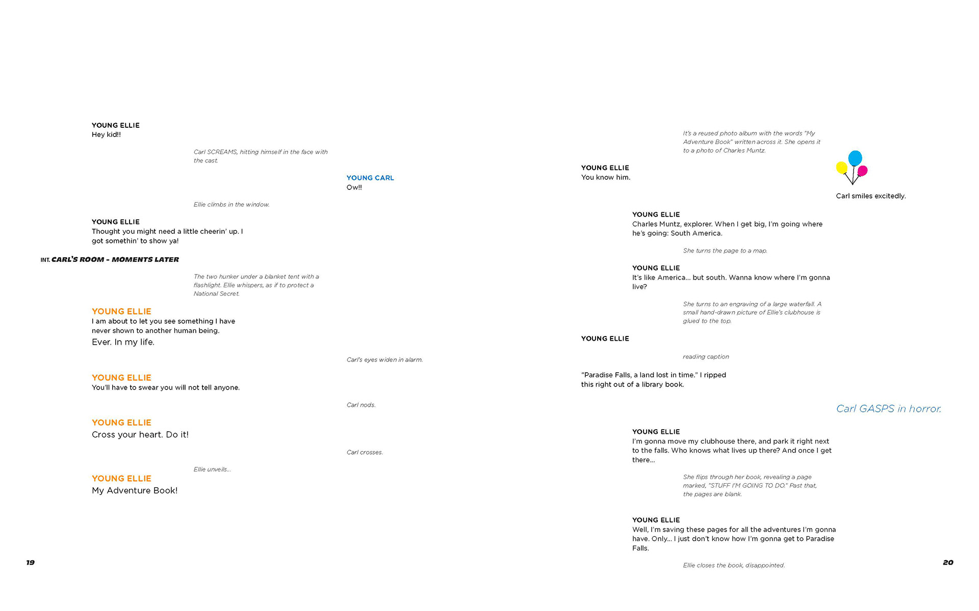
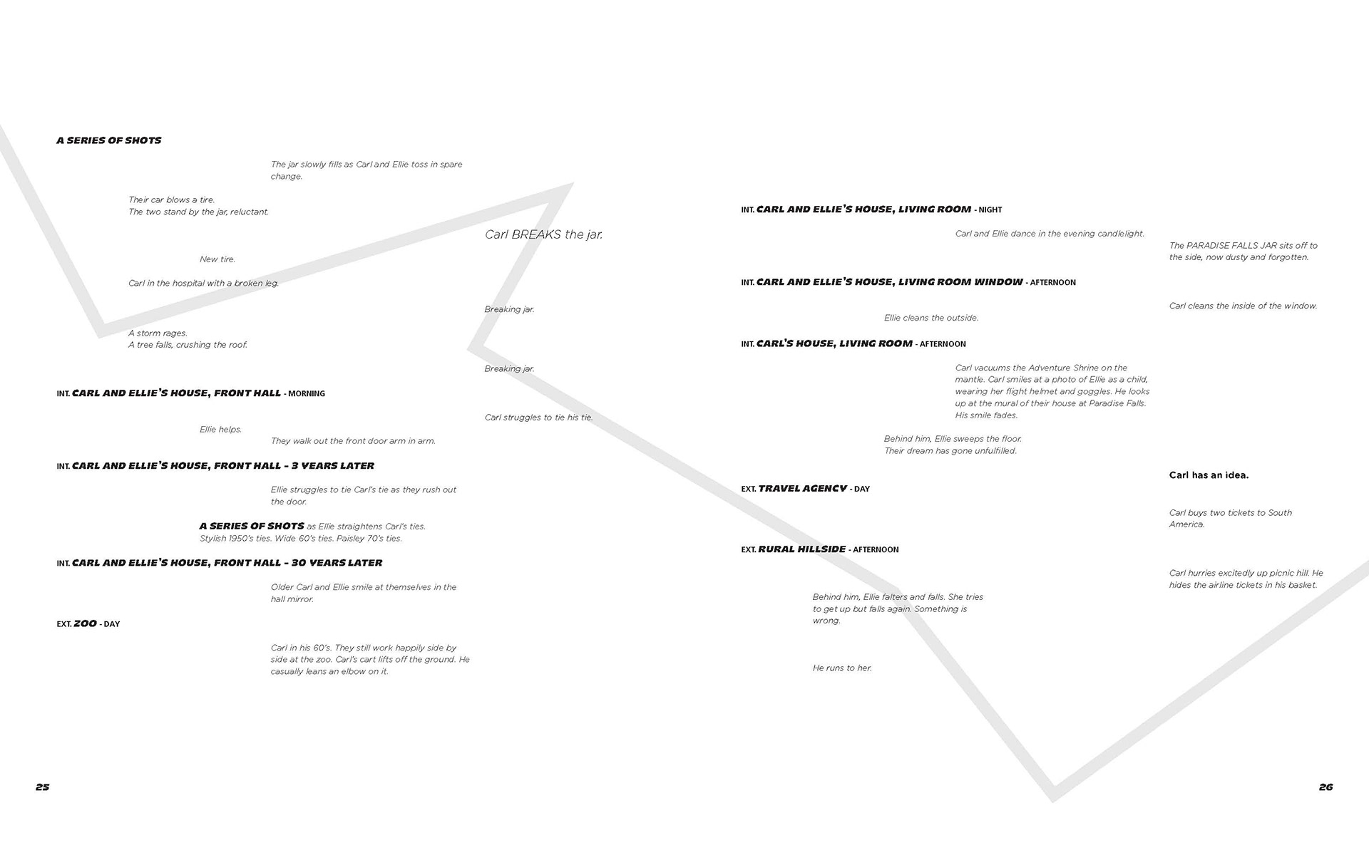
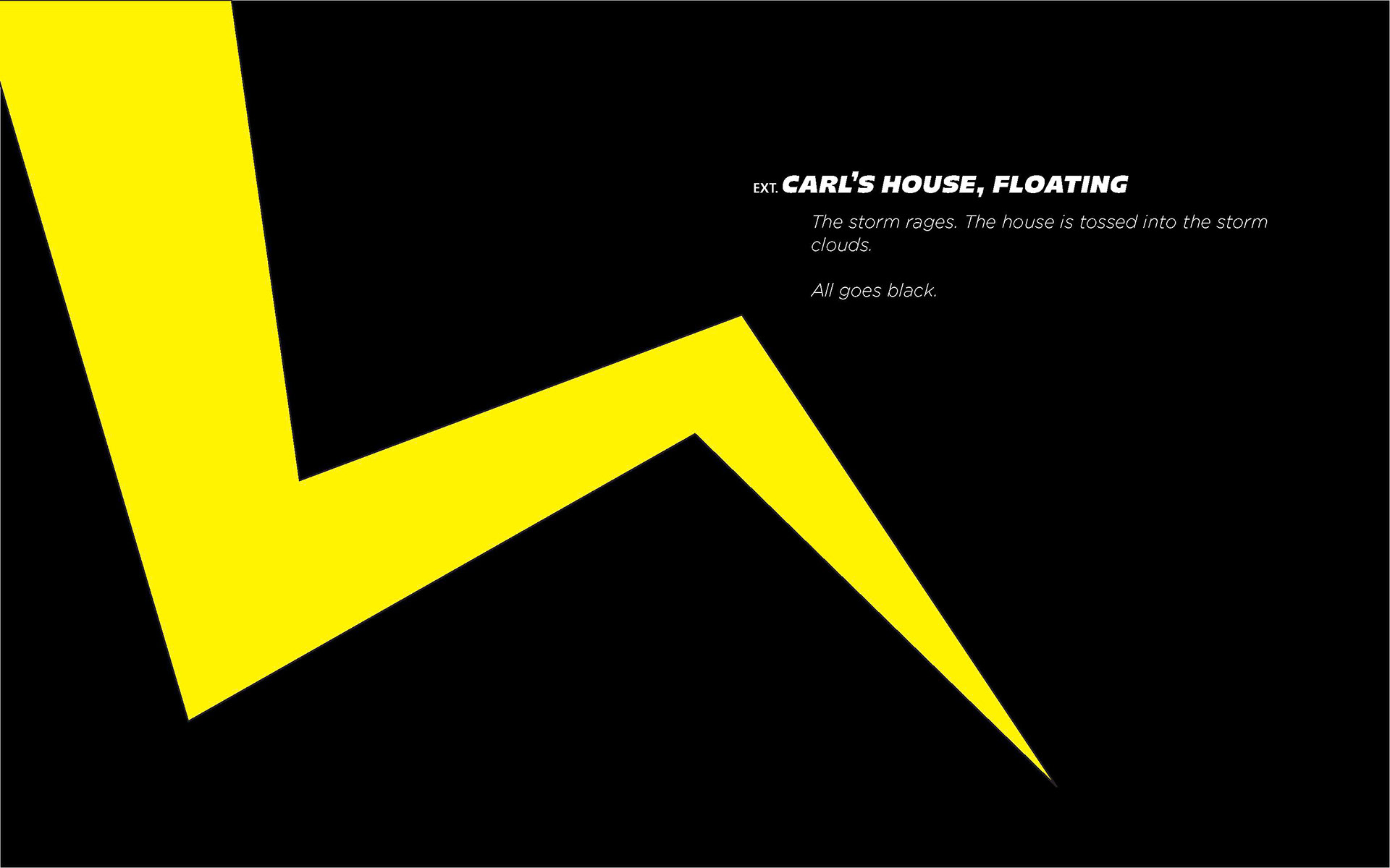
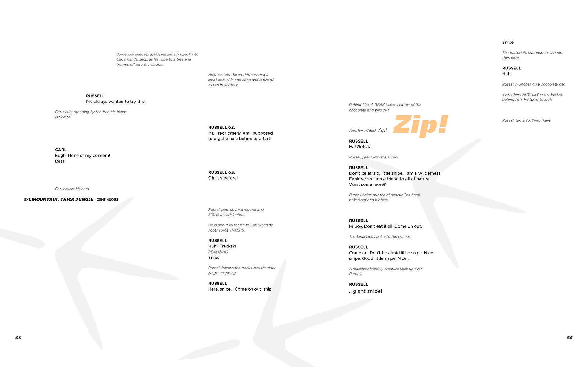
Examples of pages in-between using type indentation and weight to show hierarchy and interaction. Used visual elements and illustrations to emphasize important emotions or sections.

Typeface:
Majoris
Frutiger LT STD
Gotham Rounded